

PRODUCT
PRODUCT
JioDesk
JioDesk
A smarter desk booking solution
A smarter desk booking solution
My role - Research, UI/UX Design, Prototyping, User Testing, Project Management.
Background
Background
Jio Desk, launched by Reliance Jio in 2020, is a desk booking system designed to streamline workspace reservations. It was developed in response to the COVID-19 pandemic and the shift to remote work.
The system serves three key stakeholders:
Employee: Book workstations when working from the office.
HR/Admin: Monitor employee activity and assist with bookings.
Super Admin: Manage assets and set user permissions.
For simplicity, this case study focuses only on the employee app, keeping things clear and concise.


Design Summery
Design Summery
Introducing the upgraded design – it's now more breathable, cleaner, and functional than before. The most crucial information is right there at the forefront, ensuring a streamlined user experience!
Designed to reduce cognitive load, the improved hierarchy empowers users to effortlessly focus on what truly matters. The bottom navigation panel is responsible for streamlined functionality. This also has enhanced scalability which not only caters to the company’s current needs but also has room for future requirements.
The Health Pass feature receives a refined treatment, prominently displayed with color-coded icons for quick health status identification.
The Health Pass feature receives a refined treatment, prominently displayed with color-coded icons for quick health status identification.
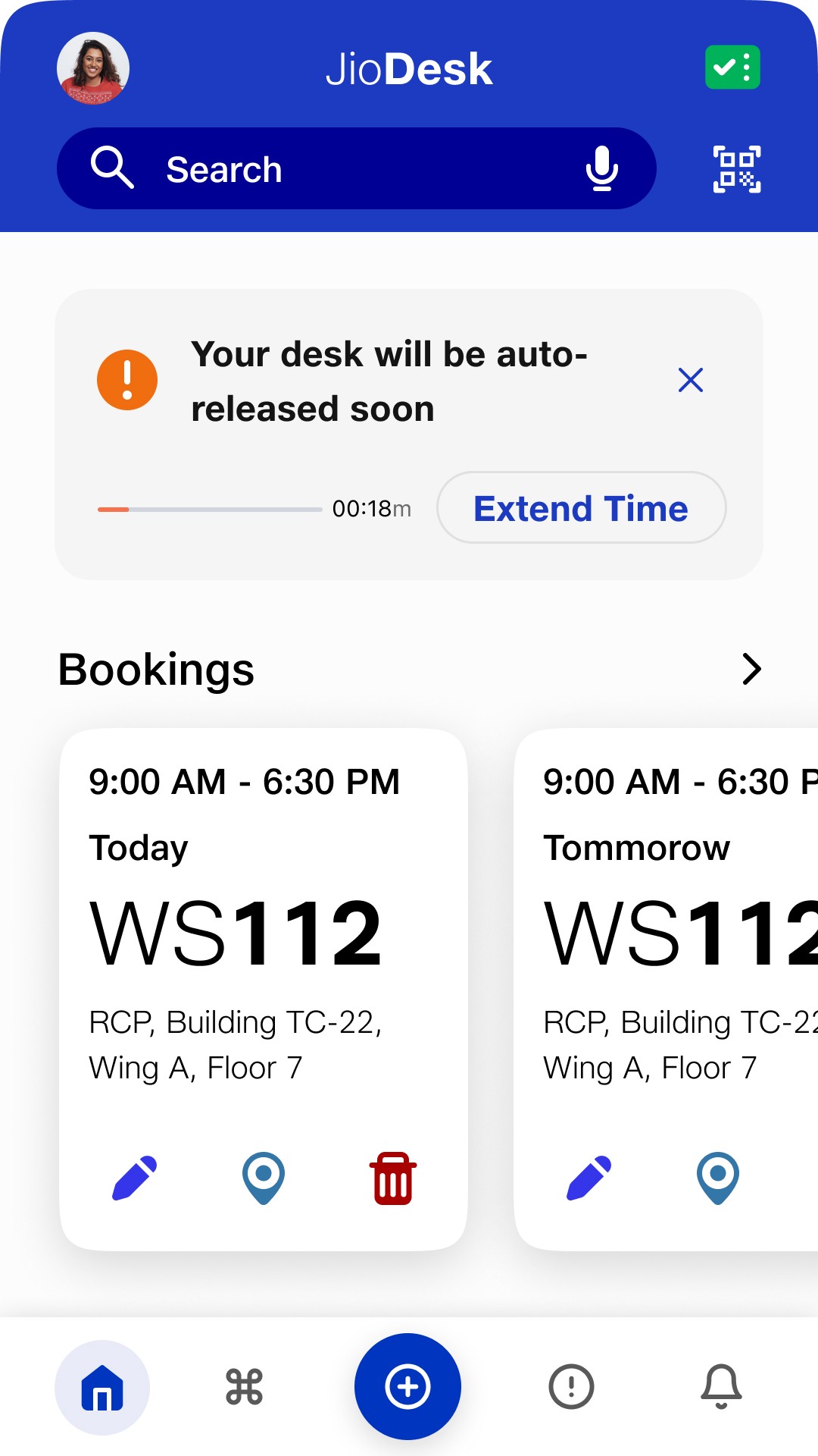


Smarter Homescreen
Smarter Homescreen
Jio Desk makes booking a workspace effortless with a clear, user-friendly design.
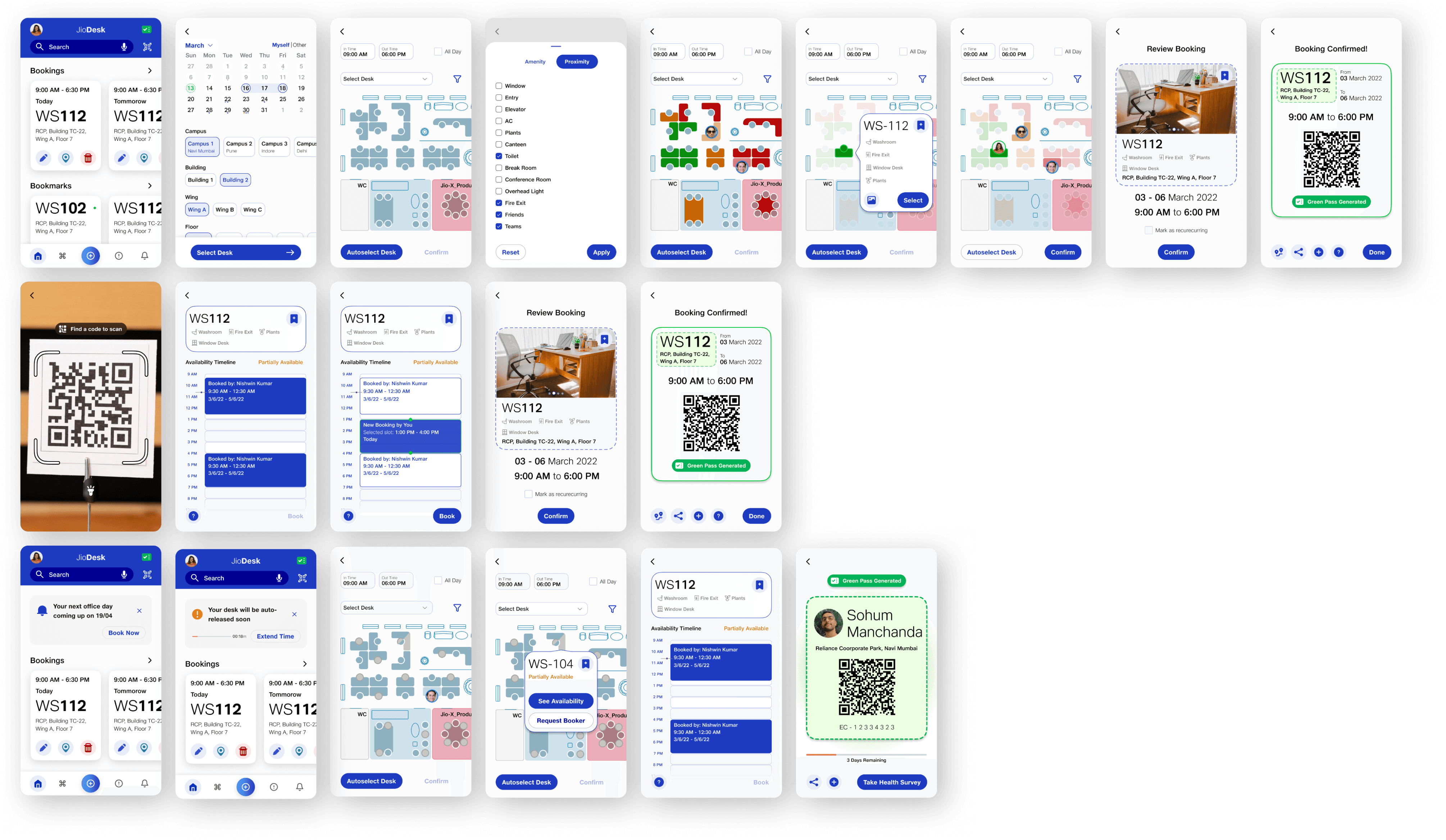
Latest bookings first: See your most recent Desk Pass bookings at the top for quick access.
Easy-to-skim cards: A structured layout helps you find key details at a glance.
Navigation & quick actions: Instantly locate your booked desk and edit or delete bookings right from the homepage.
Smart alerts: Interactive widgets highlight time-sensitive actions and disappear once they’re no longer needed.
Hassle-Free Booking
Hassle-Free Booking
Booking a desk is now faster and smarter, no more tedious location inputs!
Auto-filled location details: The system remembers your past choices and fills in location and floor info when you pick a date.
Default map view: Easily choose your desk with a clear, open floor plan.
Booking a desk is now faster and smarter, no more tedious location inputs!
Auto-filled location details: The system remembers your past choices and fills in location and floor info when you pick a date.
Default map view: Easily choose your desk with a clear, open floor plan.


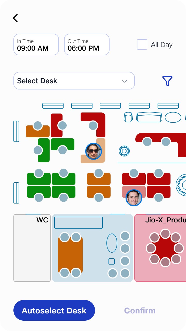


Smart filters: Find desks near windows, toilets, or other amenities with a heat map view.
See where your colleagues sit: View booked desks on the floor map to sit close to (or avoid) specific people.
Auto-Select Desk: Let the app pick the best available desk for you based on your preferences and past bookings.
Details at a Glance
Details at a Glance
Jio Desk makes reserving and managing workspaces easier than ever.
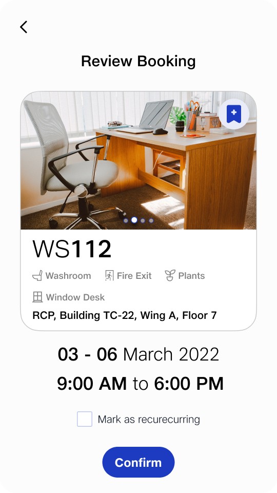
Quick desk details: Tap on a desk to see all its features in a floating window.
One-tap favorites: Bookmark desks for fast, one-click booking from the home page.
Review before booking: A new section lets users double-check and edit details before confirming.
Recurring bookings: Automate desk reservations based on your office schedule.



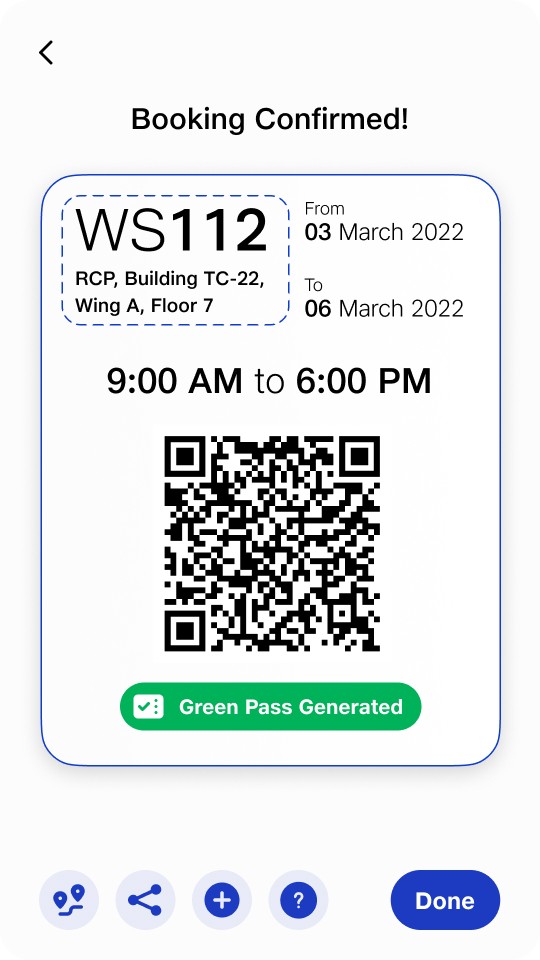


DeskPass for easy access: View all confirmed bookings in a clear, structured format.
Smart sharing & navigation: Add bookings to your calendar, share DeskPass with colleagues, and get guided navigation, perfect for newcomers.
DeskPass for easy access: View all confirmed bookings in a clear, structured format.
Smart sharing & navigation: Add bookings to your calendar, share DeskPass with colleagues, and get guided navigation, perfect for newcomers.
Hot-Desking
Hot-Desking
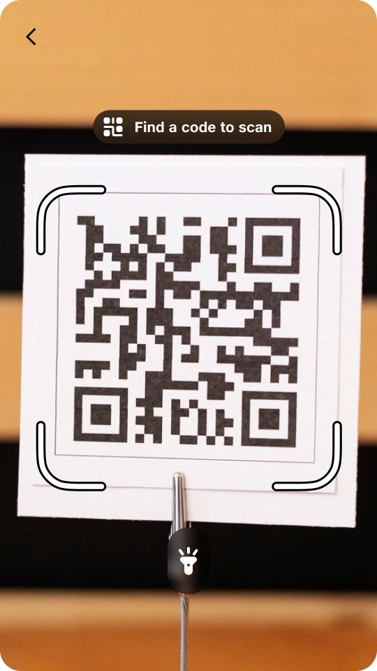
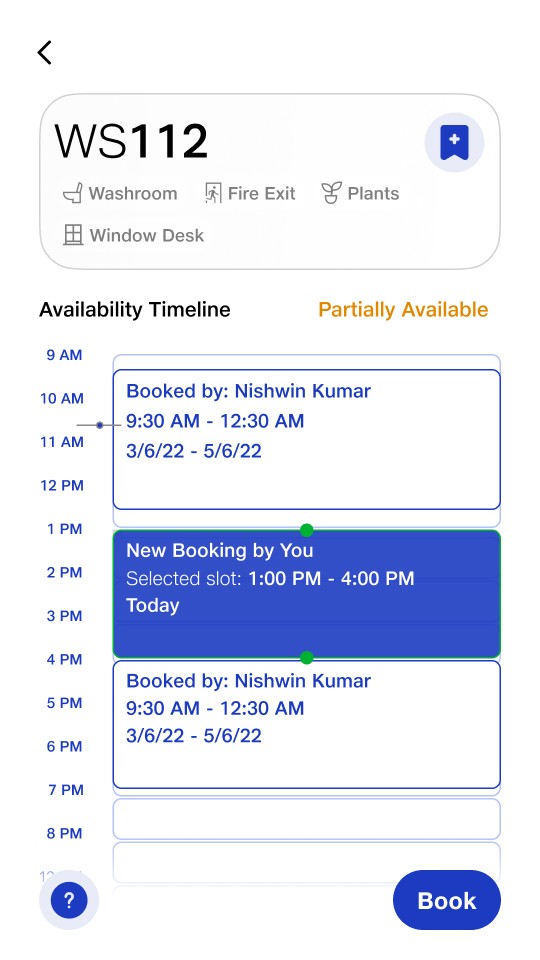
Now, users can instantly secure any desk by scanning the QR code located on the desk. Confirming the booking is now easy, directly determined by its real-time availability.
Now, users can instantly secure any desk by scanning the QR code located on the desk. Confirming the booking is now easy, directly determined by its real-time availability.



Impact 🤩 !
Impact 🤩 !
To see how users react right away to a screen or design, we showed them a glimpse of the homepage. They had only a few seconds to start looking for information. This was followed by asking them to book a desk.
To see how users react right away to a screen or design, we showed them a glimpse of the homepage. They had only a few seconds to start looking for information. This was followed by asking them to book a desk.
60%
Reduction in desk booking time from 1.46 minutes to an average of 45 seconds.
Reduction in desk booking time from 1.46 minutes to an average of 45 seconds.
53%
Increase in glanceability reducing time to spot upcoming booking details from 7.5s to just 3.5s.
Increase in glanceability reducing time to spot upcoming booking details from 7.5s to just 3.5s.
Effortless Booking: 7/10 users booked desks in seconds without guidance.
Intuitive Editing: 8/10 preferred editing via the booking card over quick icons.
Quick Access: 10/10 loved one-tap bookings from the homepage (bookmarks/recommendations).
Effortless Booking: 7/10 users booked desks in seconds without guidance.
Intuitive Editing: 8/10 preferred editing via the booking card over quick icons.
Quick Access: 10/10 loved one-tap bookings from the homepage (bookmarks/recommendations).
Social & Practical Filters: 6/10 valued filters for amenities and friend locations.
Smart Tools: All users praised widgets and recurring bookings.
Unified Experience: Green pass integration eliminated app switching for everyone.
Social & Practical Filters: 6/10 valued filters for amenities and friend locations.
Smart Tools: All users praised widgets and recurring bookings.
Unified Experience: Green pass integration eliminated app switching for everyone.


Overview
Overview
The aim of this project was to improve the existing desk booking system. The previous system was quickly made without much consideration for user experience, features, or adaptability for the future. It wasn't very user-friendly, had very few features and couldn't handle potential future needs well. To address these issues, we needed to undergo a thorough redesign.
The aim of this project was to improve the existing desk booking system. The previous system was quickly made without much consideration for user experience, features, or adaptability for the future. It wasn't very user-friendly, had very few features and couldn't handle potential future needs well. To address these issues, we needed to undergo a thorough redesign.
Tasks
Tasks
In this project I was responsible for the following:
• Research
• UI/UX Design
• Prototyping
• User Testing
• Project Management
In this project I was responsible for the following:
• Research
• UI/UX Design
• Prototyping
• User Testing
• Project Management
Problems
Lack of Intuitiveness: The existing system did not provide an intuitive user experience, leading to user confusion and reducing efficiency.
Minimal Functionality: That system offered limited functionality, hindering the seamless management of desk reservations and related activities.
Scalability Concerns: The current design had difficulty adding new features or meeting future needs, which makes it not very scalable.
Scope
Scope
User Experience (UX) Enhancement: Improve the overall user interface for a more intuitive and user-friendly experience.
Functionality Expansion: Identify and implement additional features to enhance the system's functionality, catering to the diverse needs of user personas.
Scalability and Future-Proofing: Redesign the architecture to accommodate future enhancements and requirements.
Timeline
May 2022 - July 2022
May 2022 - July 2022
Design Process
Design Process
The design process for this project essentially comprises five key steps: Study and research, Direct, Define and Ideate, UI Design and Testing.
The design process for this project essentially comprises five key steps: Study and research, Direct, Define and Ideate, UI Design and Testing.


Old Look
Old Look
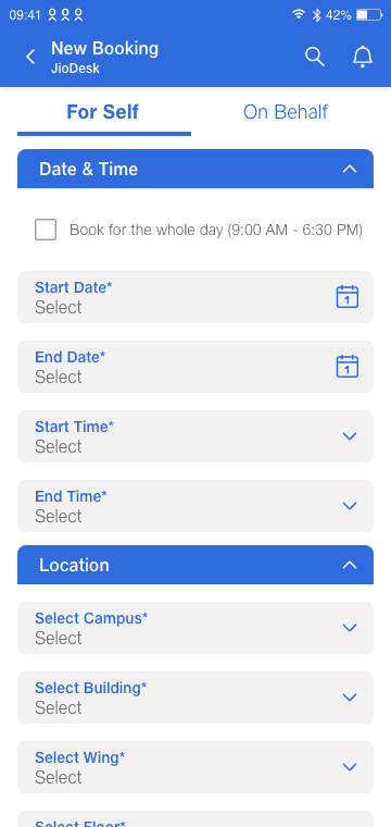
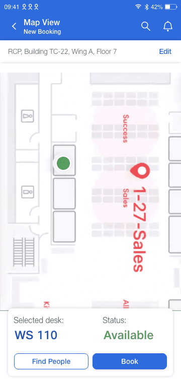
These are the screenshots of the old version of the JioDesk app.
These are the screenshots of the old version of the JioDesk app.






Website Audit
The existing Jio Desk system was designed to streamline office desk bookings, with features like security prep, HR tracking, and org-wide asset mapping. However, it lacked user-centricity, especially for employees juggling hybrid work.
The existing Jio Desk system was designed to streamline office desk bookings, with features like security prep, HR tracking, and org-wide asset mapping. However, it lacked user-centricity, especially for employees juggling hybrid work.
Original User Flow
Original User Flow
The original desk-booking process involved just 3 screens but felt unnecessarily long. Users had to navigate repetitive steps, signaling a need for simplification.
The original desk-booking process involved just 3 screens but felt unnecessarily long. Users had to navigate repetitive steps, signaling a need for simplification.


Heuristic Analysis
A usability review highlighted critical flaws:
Cognitive Overload: Too many options overwhelmed users.
No Visual Guidance: Missing floor plans left users unsure about desk choices.
Clunky Forms: Lengthy forms frustrated frequent bookers.
Dull, Crowded UI: The interface felt outdated and chaotic.
A usability review highlighted critical flaws:
Cognitive Overload: Too many options overwhelmed users.
No Visual Guidance: Missing floor plans left users unsure about desk choices.
Clunky Forms: Lengthy forms frustrated frequent bookers.
Dull, Crowded UI: The interface felt outdated and chaotic.


User Research Personas
User Research Personas
We observed real users and synthesized feedback into three personas, capturing diverse needs and frustrations.
We observed real users and synthesized feedback into three personas, capturing diverse needs and frustrations.


“Filling the same form every time is tedious.”
“Filling the same form every time is tedious.”
“Manually checking seat availability wastes time.”
“Manually checking seat availability wastes time.”
"Home screen feels cluttered and overwhelming."
"Home screen feels cluttered and overwhelming."
“Can’t find what I need quickly.”
“Can’t find what I need quickly.”
“Switching apps for green passes is frustrating.”
“Switching apps for green passes is frustrating.”
“Design feels dull and uninspiring.”
“Design feels dull and uninspiring.”
Research Insights
Some of the consolidated Insights from the research and intuition:
Repetition Fatigue: Users hated re-entering details.
Fix: Auto-save preferences or automate recurring bookings.
App Fragmentation: Green passes lived in a separate app.
Fix: Integrate passes into the booking flow.
Accessibility Blindspots: Specific needs (e.g., medical proximity) were ignored.
Fix: Let users filter desks by amenities.
Last-Minute Chaos: Forgetting to book led to stress.
Fix: Send reminders or offer shortcuts.
Visual Confusion: No detailed and accurate floor plans or type of desks with its visuals.
Fix: Add photos/descriptions to help users “see” their choices.
Key Opportunities
Key Opportunities
Some initial key opportunities and things to keep in mind:
Simplify Repetition: Auto-fill forms, save preferences, automate recurring bookings.
Unify Tools: Merge green passes and bookings into one app.
Guide, Don’t Hide: Add filters for accessibility needs (e.g., “near window”) and in-app navigation.
Show, Don’t Tell: Use floor plans and desk photos to reduce uncertainty.
Design for Stress: Reminders, shortcuts, and a cleaner UI to reduce friction.
Problem Statement & Design Statement
Problem Statement & Design Statement
Based on all the research, I arrived at the following problem (how might we?) statements and a design statement:
How might we help the employee to book a desk in a way which is very simple, efficient, quick and keeps the user well informed about the the booking made?
How can we help the employee to check in to an available desk on site (Hot-Desking)?
How can the user navigate to its booking?
How can a user find the booking of another user/group?
How can a user make a booking on behalf of another user (employee or visitor)?
How can we help the user to extend/release the resource after their usage time extends/remains?
How can a user raise complaints about booking and assets?
How?
How?
How?
How can a user make a booking on behalf of another user (employee or visitor)?
How can we help the user to extend/release the resource after their usage time extends/remains?
How can a user raise complaints about booking and assets?
How?
How?
How?
Create a unified system for managing assets and desk/space bookings that’s efficient, scalable, and user-friendly, replacing fragmented tools with one adaptable platform.
Create a unified system for managing assets and desk/space bookings that’s efficient, scalable, and user-friendly, replacing fragmented tools with one adaptable platform.
Create a unified system for managing assets and desk/space bookings that’s efficient, scalable, and user-friendly, replacing fragmented tools with one adaptable platform.
Brainstorming & Feature Listing
Now, it was time for one of my favorite parts, thinking of all the cool features this new solution should have.
Here are some of the features:
The manager or HR can put in the schedule data on the app. This way, the system will notify employees to book their seats, and users can easily choose options like book or let it auto-book.
Desks and conference rooms can be labeled with features like proximity to AC, window view, near the washroom, close to the entry, and other characteristics based on their location.
The user can see the people attending a conference in any conference room.
Navigation to desk/Conference room.
Hot-Desking
and many more!


Competitor Analysis
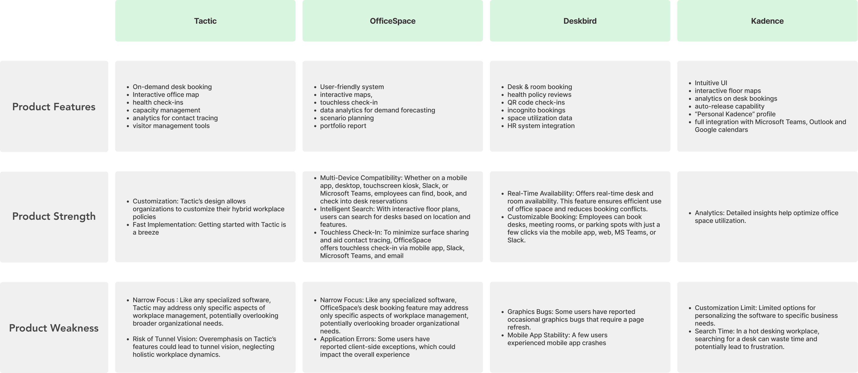
It's crucial to understand the competition! In my analysis, I researched OfficeSpace, Tactick, DeskBird, and Kadence, collecting insights.
It's crucial to understand the competition! In my analysis, I researched OfficeSpace, Tactick, DeskBird, and Kadence, collecting insights.
Existing solutions prioritize organizational needs over employee experience, lacking scalability (e.g., Tactic, Office Space). While most offer basics like floor maps and health check-ins, they fall short on critical gaps: no off-site access, rigid floor plan edits, limited admin controls, and poor multi-device support. Notably, none provide intelligent recommendations or advanced filtering, key for personalized, efficient workspace booking.
Existing solutions prioritize organizational needs over employee experience, lacking scalability (e.g., Tactic, Office Space). While most offer basics like floor maps and health check-ins, they fall short on critical gaps: no off-site access, rigid floor plan edits, limited admin controls, and poor multi-device support. Notably, none provide intelligent recommendations or advanced filtering, key for personalized, efficient workspace booking.


Information Architecture
Now that I had gathered all the insights, it was time to define and ideate. Making the information architecture was the first step to do that, this involved things: 1. Site Mapping 2. User Flow
Now that I had gathered all the insights, it was time to define and ideate. Making the information architecture was the first step to do that, this involved things: 1. Site Mapping 2. User Flow
Sitemap
This sitemap shows how users will move through the platform, where information is located and how different elements relate to each other. It also plays a key role in planning and improving the user experience by making sure the navigation structure is logical and easy to follow.
Sitemap
This sitemap shows how users will move through the platform, where information is located and how different elements relate to each other. It also plays a key role in planning and improving the user experience by making sure the navigation structure is logical and easy to follow.


User Flow
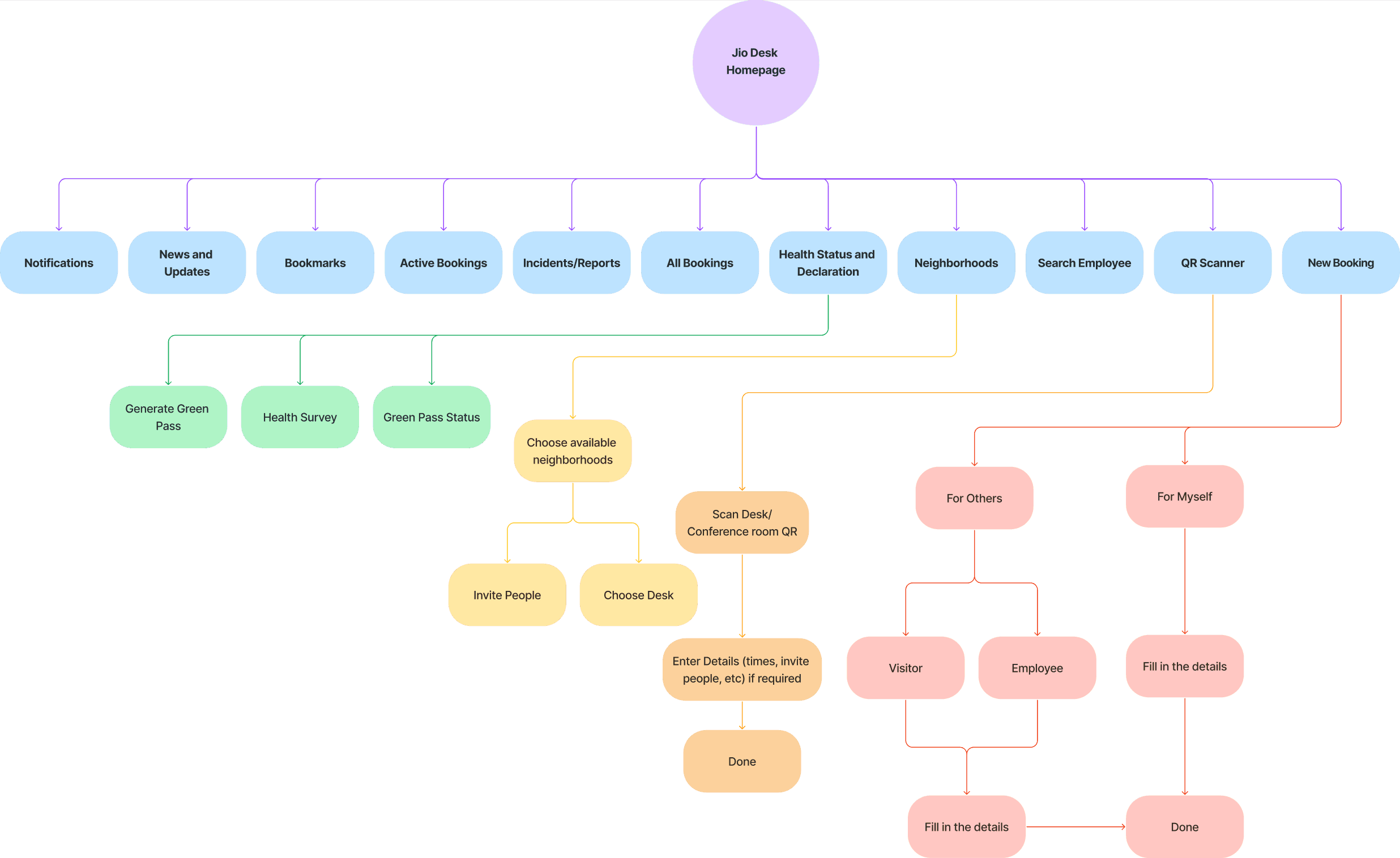
I created a user flow map that explains how employees will book a desk using the new app. This new process is designed to be more efficient, cutting down on unnecessary steps, making it easier for users, and allowing them to book a desk faster compared to the old way.
User Flow
I created a user flow map that explains how employees will book a desk using the new app. This new process is designed to be more efficient, cutting down on unnecessary steps, making it easier for users, and allowing them to book a desk faster compared to the old way.


Wireframes
Wireframes
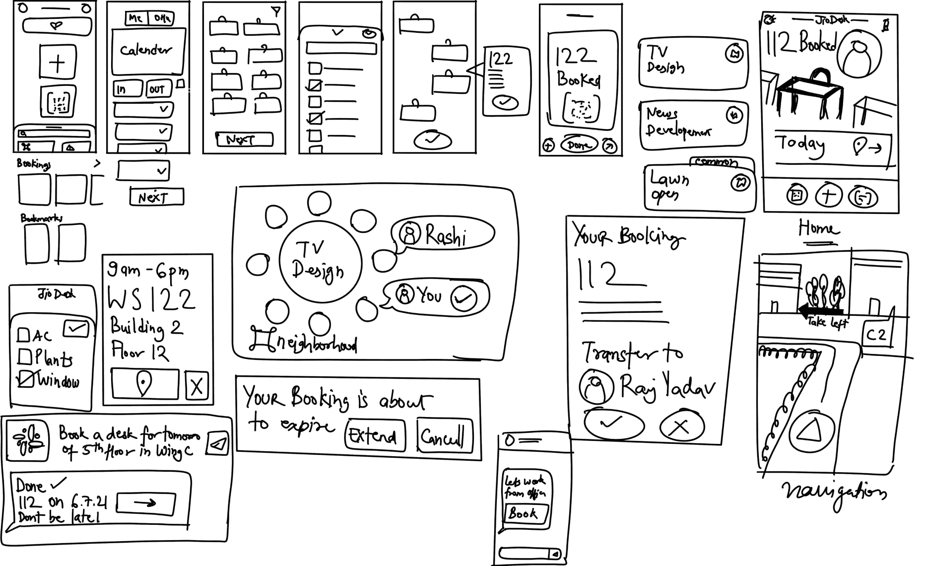
Started with rough sketches to explore concepts, then created low and high-fidelity wireframes to refine and visualize the design.
Started with rough sketches to explore concepts, then created low and high-fidelity wireframes to refine and visualize the design.


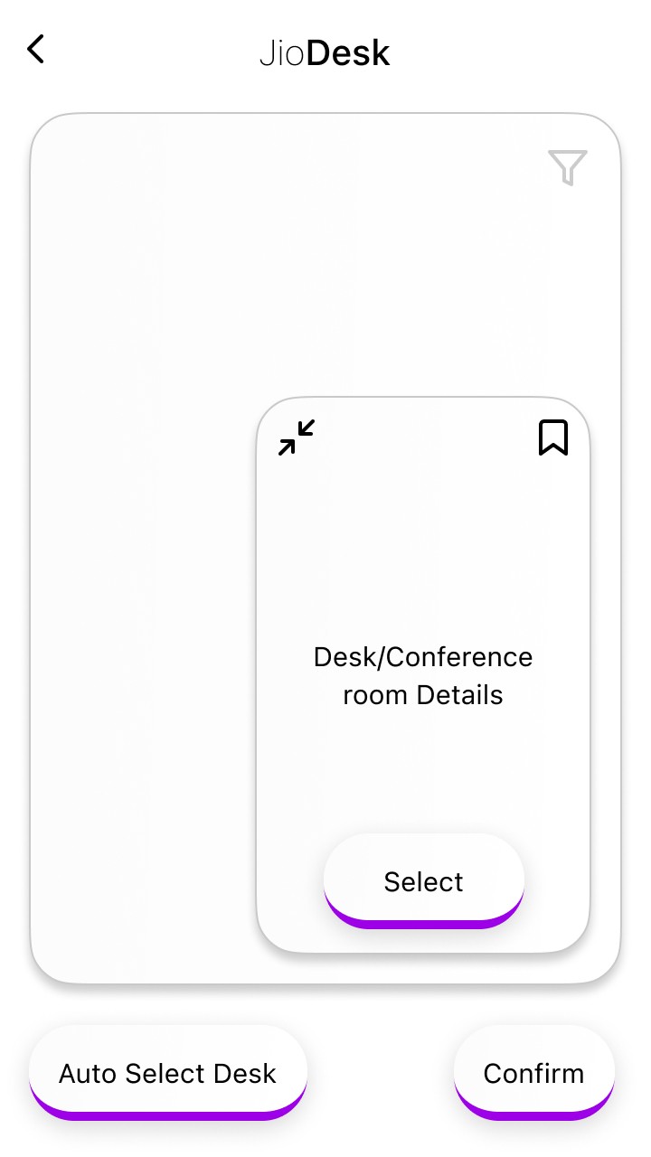


After sharing initial HiFi wireframes with my design manager for feedback, I refined the homescreen based on his UX-focused suggestions, significantly improving the overall app experience.
After sharing initial HiFi wireframes with my design manager for feedback, I refined the homescreen based on his UX-focused suggestions, significantly improving the overall app experience.
• Instead of always prioritizing desk booking, the process should be made more user-friendly.
• The importance of QR scanning and hot-desking should be reduced, while Greenpass should be given more priority since it determines desk booking entitlement.
• Instead of always prioritizing desk booking, the process should be made more user-friendly.
• The importance of QR scanning and hot-desking should be reduced, while Greenpass should be given more priority since it determines desk booking entitlement.

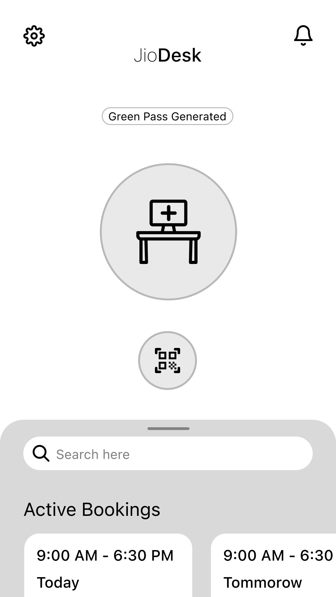


• Users should be kept informed about relevant updates, and there should be an intuitive way for them to learn how to use the app.
• The bottom sheet is becoming too heavy, which could lead to layering issues in the future. Scaling it further will add more load to the app, making performance management a challenge.
Recomendation: Desk booking was prioritized every time, making navigation less intuitive.
Fix: Introduced quick-book options, repositioned booking and QR scanning, and replaced the bottom sheet with a navigation panel for better usability.
Recomendation: Desk booking was prioritized every time, making navigation less intuitive.
Fix: Introduced quick-book options, repositioned booking and QR scanning, and replaced the bottom sheet with a navigation panel for better usability.

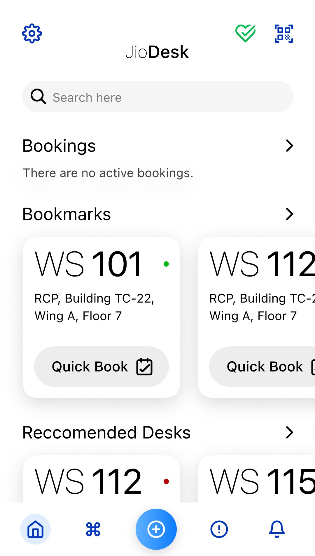
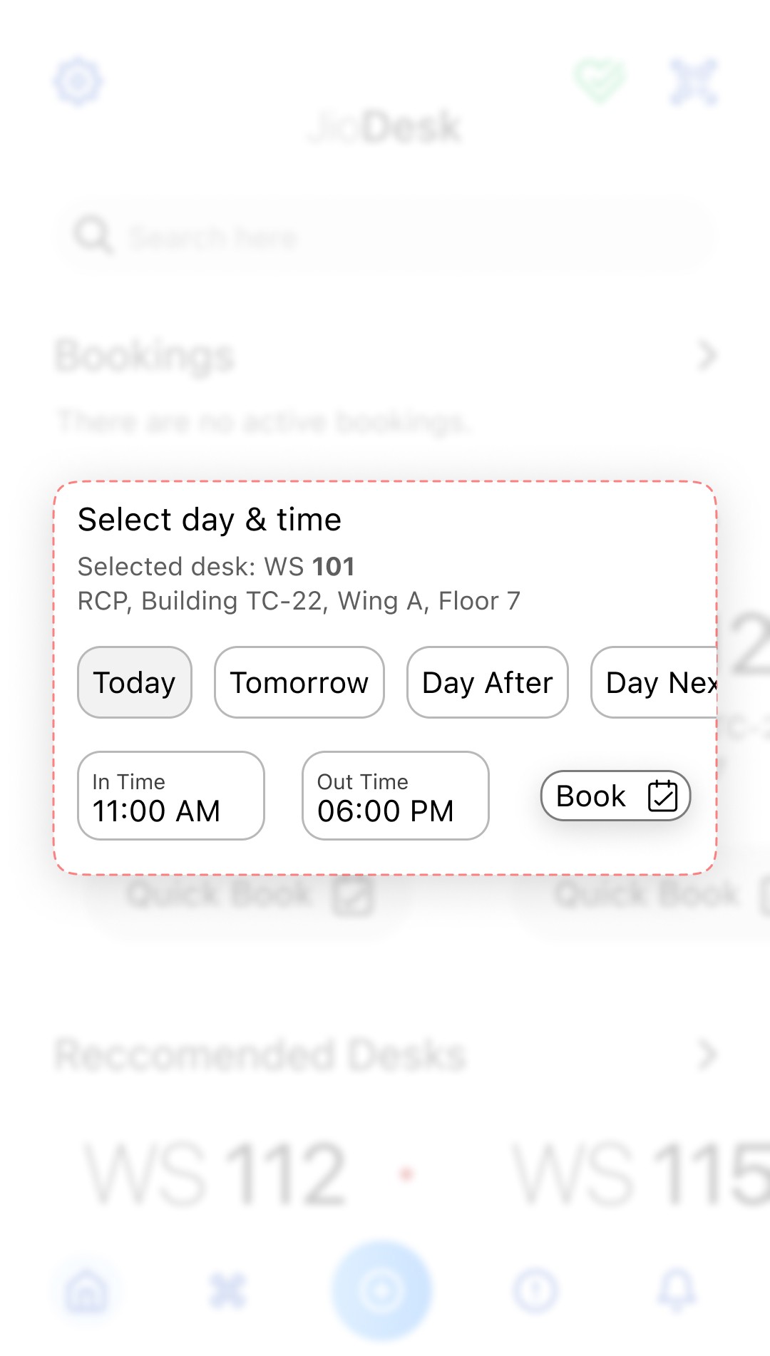
Recomendation: Users lacked real-time updates and guidance on using the app.
Fix: Added interactive widgets for updates, onboarding screens for learning and moved Greenpass to the top with live status indicators.
Recomendation: Users lacked real-time updates and guidance on using the app.
Fix: Added interactive widgets for updates, onboarding screens for learning and moved Greenpass to the top with live status indicators.
Mood Boarding
Mood Boarding
The app needs a modular, organized layout with clean hierarchy, aligned to Jio’s Design System. Mood boards and UI elements will ensure visual consistency, reduce learning curves through familiarity, and strengthen brand identity across platforms.
The Design Language consists of :
• Visual Style
• Icons
• Fonts and Text Styles
• Colours
• Layout and Spacing


User Testing
User Testing
While the strengths have been discussed earlier, testing revealed key areas for improvement:
• Editing Flow: 5/10 users tapped the booking card to edit instead of using quick edit icons, indicating they were not intuitive.
• Auto-Selection: 9/10 users preferred desks to auto-select without clicking the “Auto Select” button.
• Delete Button Placement: 4/10 users expected the delete option inside the edit booking screen rather than upfront.
• Privacy Concerns: 3/10 users preferred not to show when and where they were working in the office.
How can we improve?
How can we improve?
• Auto-Select Desks: Default auto-selection simplifies booking.
• Delete Button Placement: Keeping it in edit may add steps but avoids clutter.
• Privacy Toggle: Users should have the option to hide their desk location.
• Desk Transfer Requests: Useful but needs safeguards to prevent misuse.
• Auto-Select Desks: Default auto-selection simplifies booking.
• Delete Button Placement: Keeping it in edit may add steps but avoids clutter.
• Privacy Toggle: Users should have the option to hide their desk location.
• Desk Transfer Requests: Useful but needs safeguards to prevent misuse.
Key Takeaways
Key Takeaways
This project was a learning experience where I made design decisions, collaborated with product managers, my design manager, HR, developers, and business teams, and tested ideas with users. Seeing their reactions gave us valuable insights.
A key takeaway was the need to balance user needs with business goals. Exploring user stories and scenarios helped align the design with stakeholder expectations. Challenges like tight deadlines, remote testing, and limited competitor access made the process demanding but rewarding.
Working within time, business, and technical constraints required focus, but the final outcome met expectations. My manager’s trust and support gave me the confidence to lead the project to completion, leaving me better prepared for future challenges.
© 2035 by Sohum Manchanda